What’s new at the studio
Getting ready!
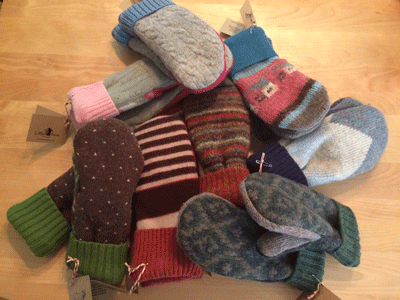
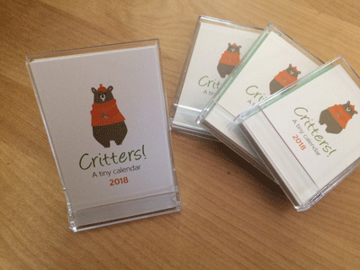
Fall is in the air, and we all know what that means… it’s a great time to start your holiday shopping! The annual Backroads Studio Tour of Central Mass takes place on Sept. 30 and Oct. 1 this year. Little House has just delivered a fresh supply of items like hand-crafted recycled sweater wool mittens and 2018 mini calendars to Dandelions in Barre and the Petersham Art Center for the event. Check it out! Take a drive and enjoy this beautiful season.
www.backroadsstudiotour.com
Practical art
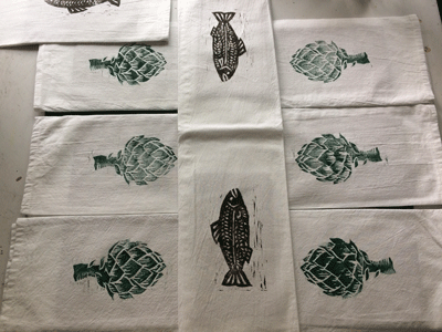
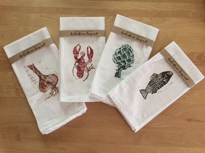
This summer, I played around with various printing techniques, and hit upon a really cool product–foam printing blocks by Speedball. These soft, spongy rectangles can be carved with linoleum cutters, covered with a thin coat of ink or paint, then pressed onto paper or fabric. The effect is that of a wood cut graphic, but the carving process is much easier because the material is soft and easy to manipulate. Here’s the final product created and being sold in local shops!
9-piece commission
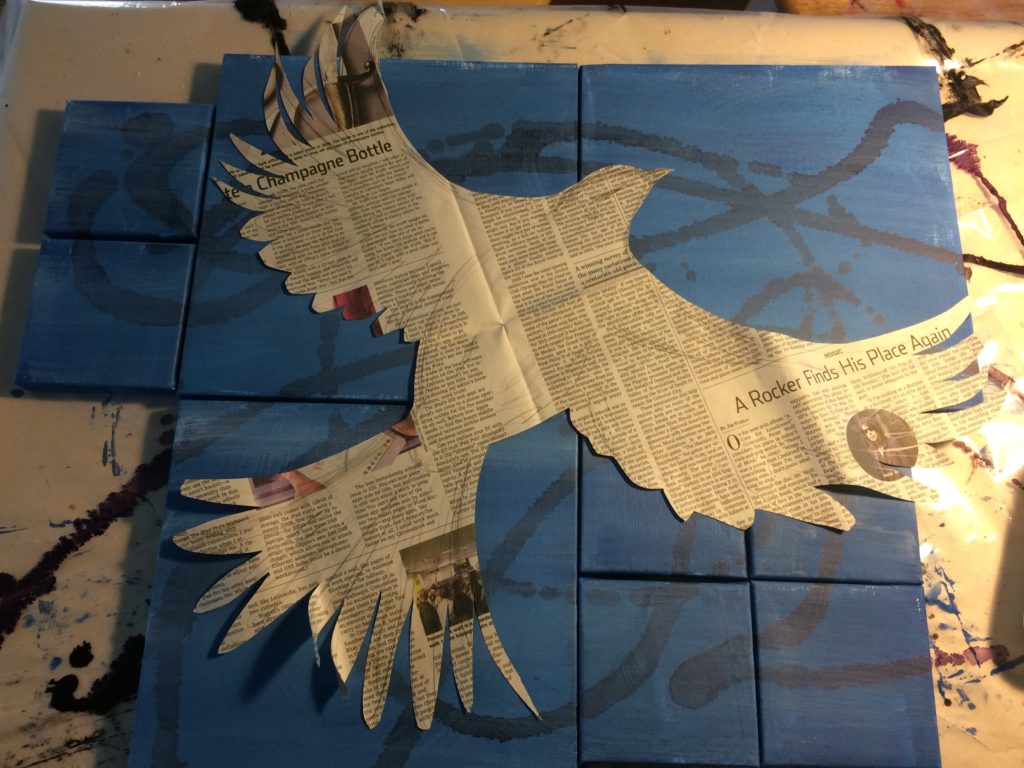
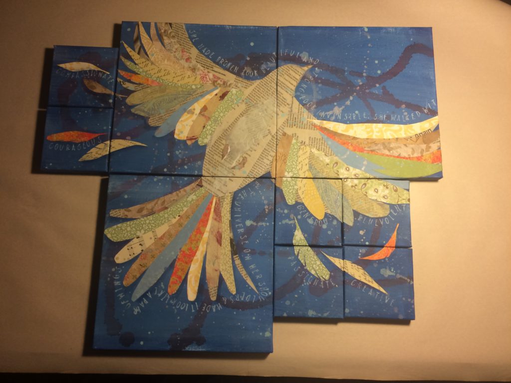
I was asked to create nine pieces for family to be distributed at an upcoming family reunion. The only direction given was that the pieces should somehow relate to each other, and each of the smaller panels should contain a specific word that described a strong trait of the recipient.
Here’s how it came together in six simplified steps:
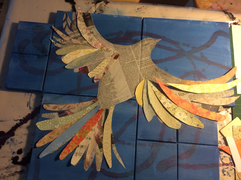
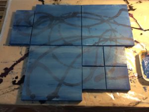 I started out knowing that I wanted the pieces to actually connect, to symbolize the family as a single unit made up of many different parts. The common background color and swirls of alcohol ink provide this visual foundation.
A bird in flight was a strong, personal symbol for this family, and for me as an artist.
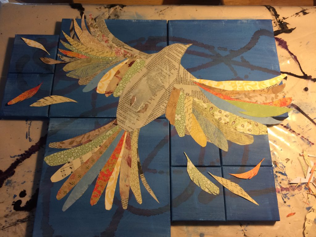
The multi-colored feathers also took on deep meaning as it added color and patterns that resembled a quilt, another strong symbol for this family.
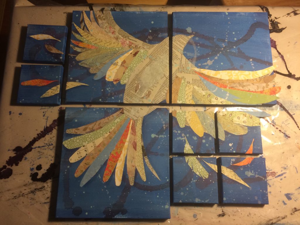
Feathers were added to the outside panels so that each recipient had a piece with visual interest and connection to the entire image. At this point, the panels are still physically connected by the graphic elements. Paint splatters are added for texture.
When dry, the pieces were carefully cut apart with an X-acto knife.
Edges were finished, words were added, hanging hardware applied. Finished!
